

Overview
Our client was Earth Genome which is a non-profit organisation with the mission to make environmental data accessible to all. I conceptualised and designed a new product Spot to help journalists find the right satellite imagery to use in their reporting.
The Challenge
Design V1 of a responsive web application which allows journalists to easily search for, purchase and download satellite imagery and perform analytics on the imagery.
Distill brand principles and design a basic style guide and brainstorm brand name.
MY ROLE
Product Designer
User Research
UX/UI Design
Visual Branding
Prototyping & Usability Testing
Project Management
Timeline
8 weeks
Platform
Responsive Web Application
The Outcome
Delivered on (a) the design of a responsive web application for Spot, (b) extensive user research and industry competitive analysis, and (c) brand principles and a basic style guide.
Validated the working prototype with and received positive feedback from Spot's target users news agencies.
The prototype will be used to pitch to potential investors.
Spot will be in development with the estimated launch in 2018.
Click around our final prototypes: Desktop and Mobile, or watch it in action below.
Design Process

Empathize
As we were designing a new product from scratch, the emphathize stage was particularly important for us to answer these questions:
Who are the users of satellite imagery?
What are their needs and pain points around using satellite imagery?
What are existing solutions in the market?
Industry Research
We started with industry research to understand the subject matter of satellite imagery and its current use cases. We found that apart from national interest uses and for private companies, the main uses were for journalism, environmental studies and human rights studies.
Customer Development Interviews
We reached out to 50 individuals in journalism, environmental studies or human rights studies and conducted 10 customer development interviews. Organizations we talked to included NBC, Washington Post, Mongabay, National Geographic, the San Diego Union Tribune and UC Berkley.
The interviews were valuable for us to understand their behavior, needs and pain points around using satellite imagery.

Here’s a few key insights from our interviews:
Journalists visit multiple sites and spend a long time looking for the right satellite imagery.
Existing satellite imagery searching applications are difficult to use.
Journalists use satellite imagery as illustration in their stories and also as an investigative tool.
Journalists mostly use free imagery and have limited budget for paid imagery.
Geo-data is needed to identify location of the satellite imagery and to feed into other analytics platform for in-depth analysis.
Academics have budget for buying imagery and want to find better tools for effective storytelling and analysis of the imagery.
Competitive Analysis
To survey the existing solutions in the market, we identified and examined 13 public and private services that provide satellite imagery and conducted a competitive analysis.
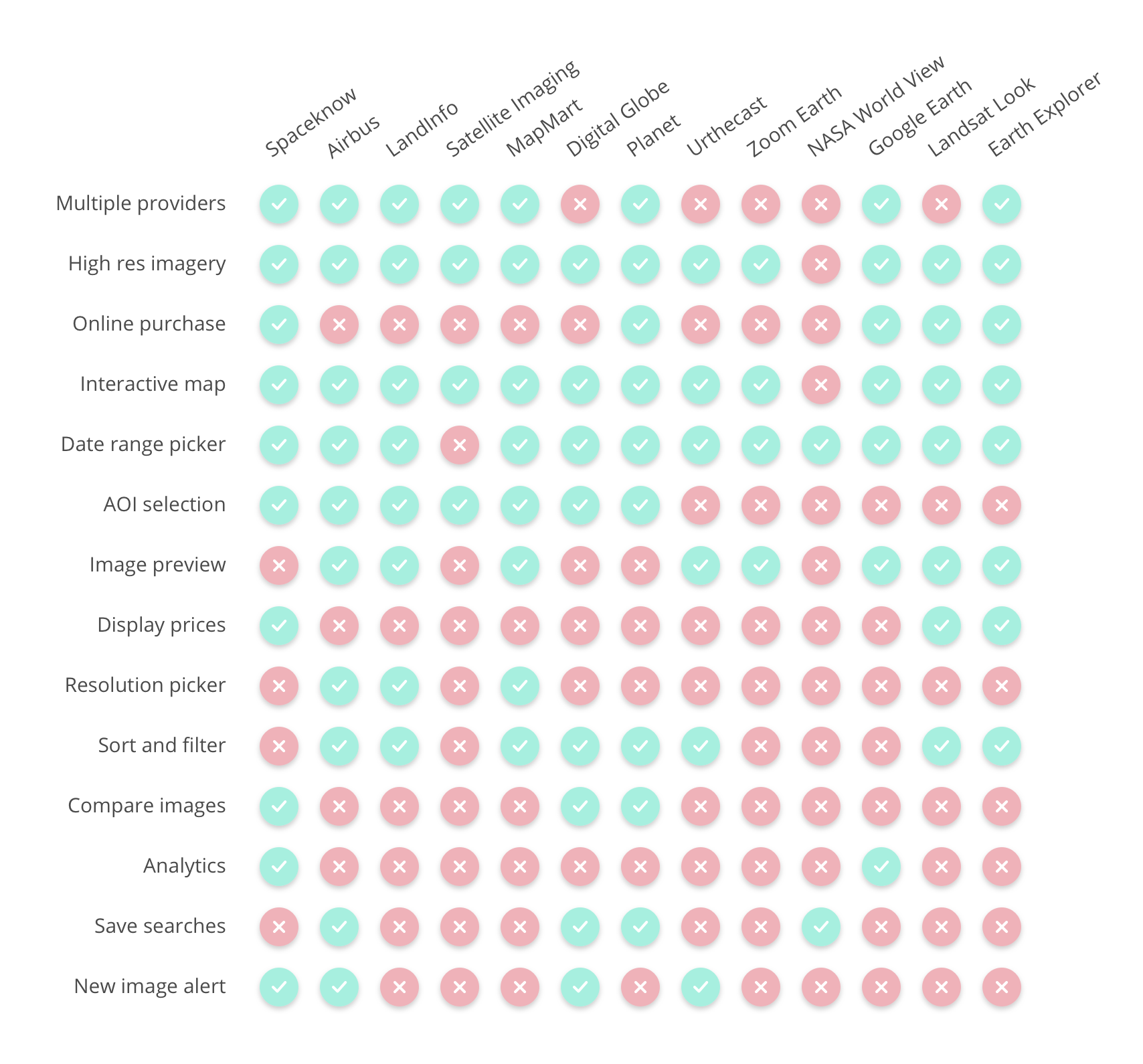
Comparative Usability Testing
Next, we picked the 3 main competitors and conducted 5 usability tests each to understand what worked and what didn’t. One common usability issue was the interaction when drawing the area of interest (AOI) box. In search of better solutions, we found two other products with a similar function but different treatment, and we tested the drawing function with 3 users each.


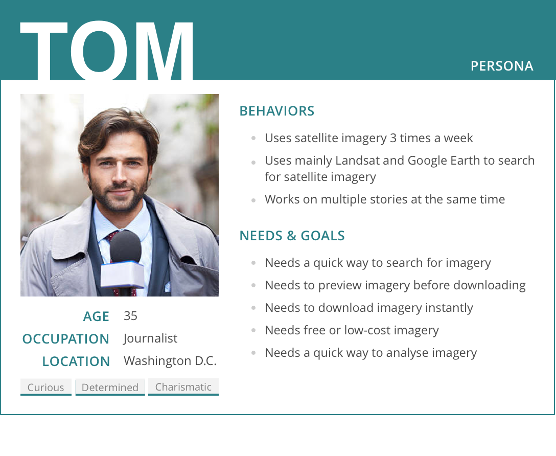
Persona Development
Based on our research, we developed a provisional persona to help us keep the needs of the user in mind when making design decisions.
DEFINE
We discussed the findings of our research with the Earth Genome team and agreed on the positioning of Spot:
Value Proposition: One-stop platform for (a) searching, previewing and downloading satellite imagery aggregated from multiple private and public sources and (b) performing simple analytics on purchased imagery.
Target users: Journalists
Our research uncovered other pain points around satellite imagery (such as better in-depth analytic tools and storytelling tools) but we decided they were out of scope for our V1. We also decided to only target journalists in V1 because although with more budget academics had other needs that would not be addressed in our V1.
Job Stories
Based on the customer interviews, we used the Jobs To Be Done framework to create job stories. This helped us dig into the different contexts in which a journalist would use our application and understand his motivation and desired outcome.

Features
The job stories helped us define product needs, which we translated into a list of features which would help users complete those jobs.
BRANDING
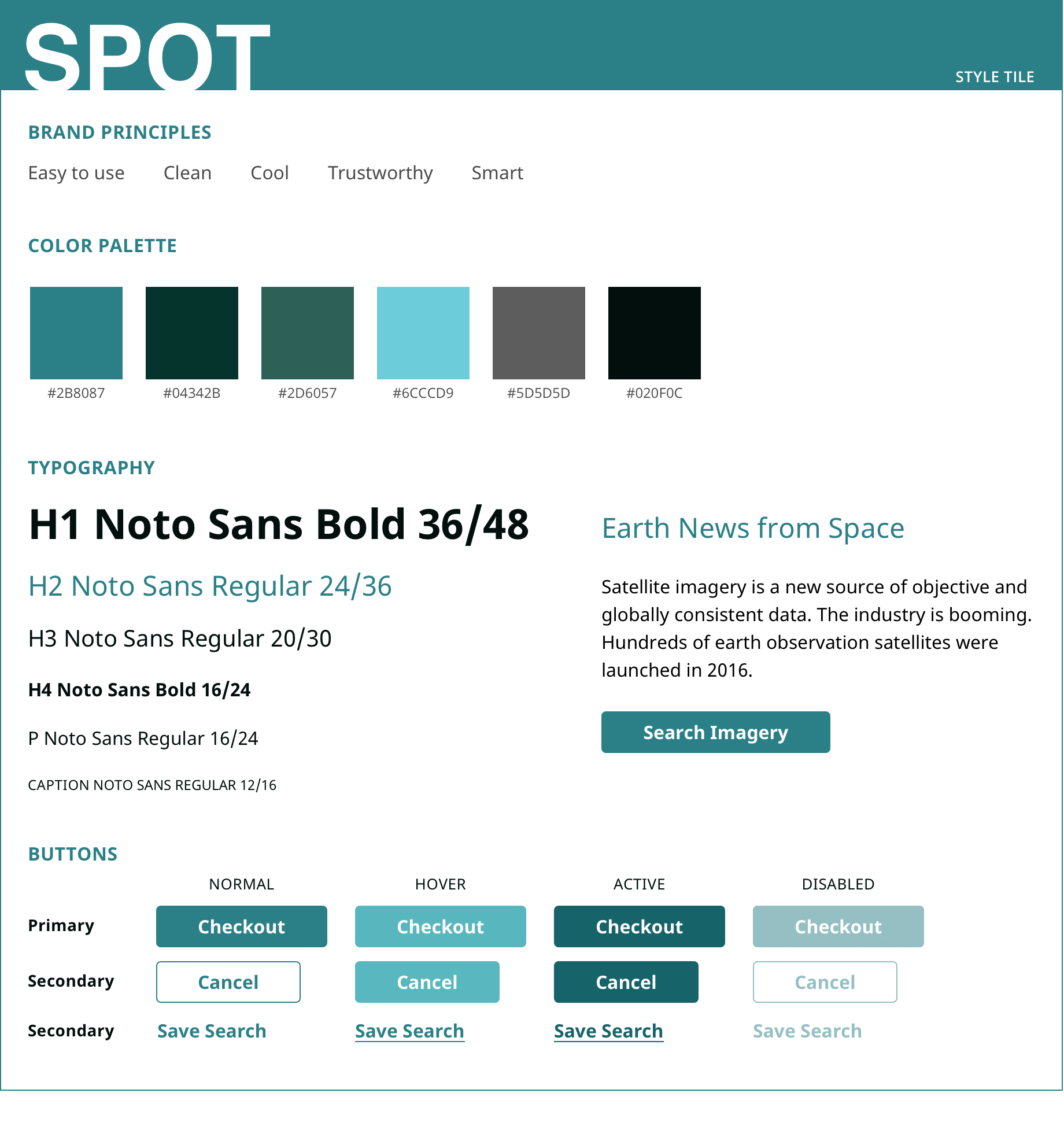
Brand Principles and Style Guide
I led a branding workshop with the Earth Genome team to identify the brand principles of Spot.


At the end of the branding workshop, we arrived at these brand principles: Easy To Use, Trustworthy, Clean , Smart, Cool.
Based on the brand principles, we explored different sets of typography and color palettes and after several rounds of iteration, arrived at the final style guide.
Brand Name
At this point, the product was still using a temporary name Newsy. I led a brainstorm session with the Earth Genome team where we diverged and created a list of descriptive, suggestive and fanciful names based on the product’s positioning statement and brand values. We then voted based on an established criteria. In the end, Spot was picked as the brand name.

IDEATE
Responsive Web
We decided to design for desktop first and that the mobile version will have reduced functions without the analysis tools. This was based on our conversations with the users about how they search for and use imagery and our understanding from the Earth Genome team on the technical difficulty of implementing analysis tools on mobile.
Task Flow
We mapped the task flow of a user’s journey to search for, purchase and analyse satellite imagery to help us think through how the features would fit in.

Design Studio
Armed with the persona, feature list and task flows, we were ready to start sketching. In order to diverge and rapidly generate ideas, I led a Design Studio with the Earth Genome team using the Lean UX approach. Through multiple rapid rounds of sketching, presenting, critiquing and refining ideas, we arrived at a diverse set of possible designs.
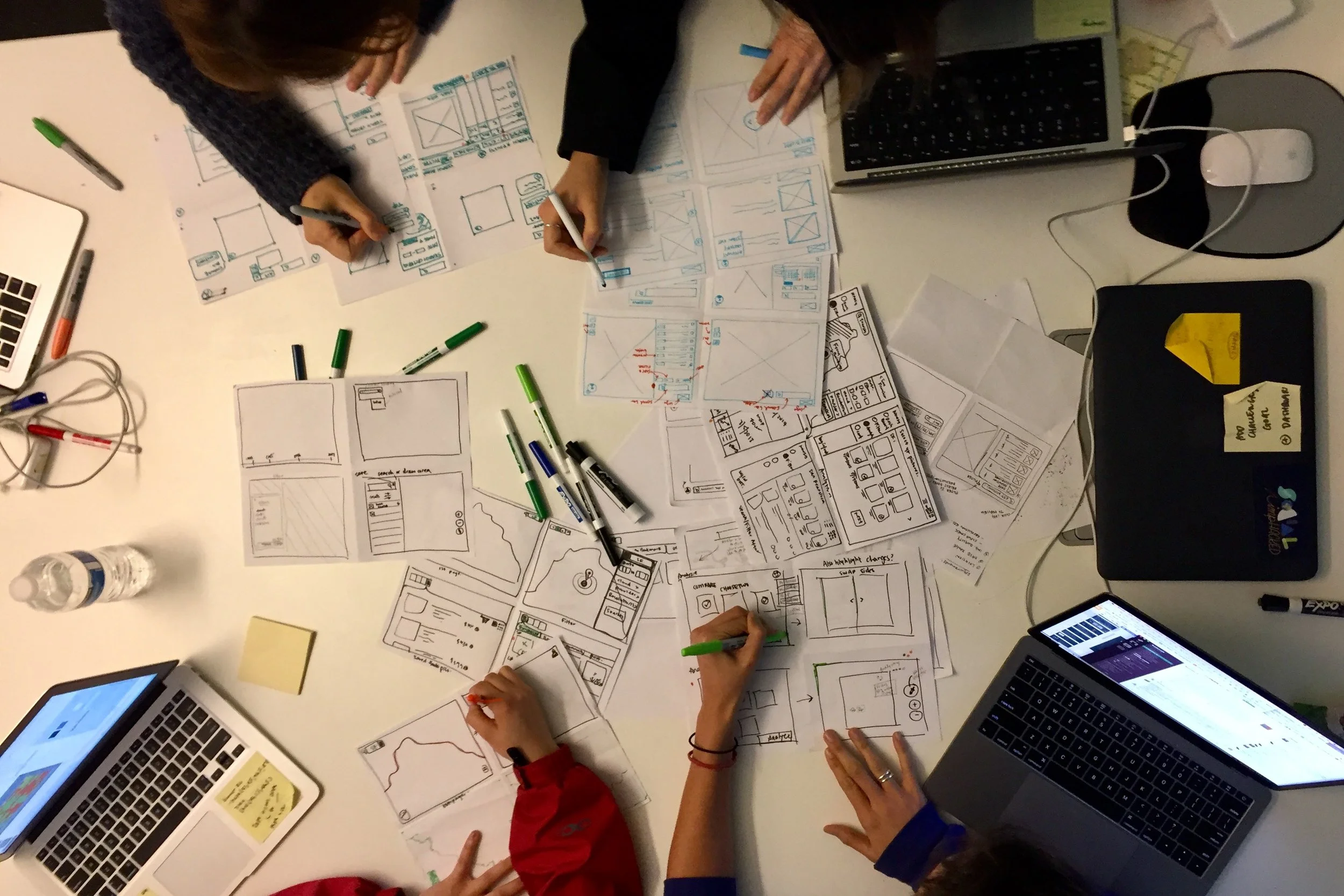
Whiteboard UI Sketches
We then converged on the top designs by dot-voting and split into two teams to whiteboard the wireframes, one team focusing on the pre-purchase screens and another team on the post-purchase screens.


LO-FI PROTOTYPING AND VALIDATION
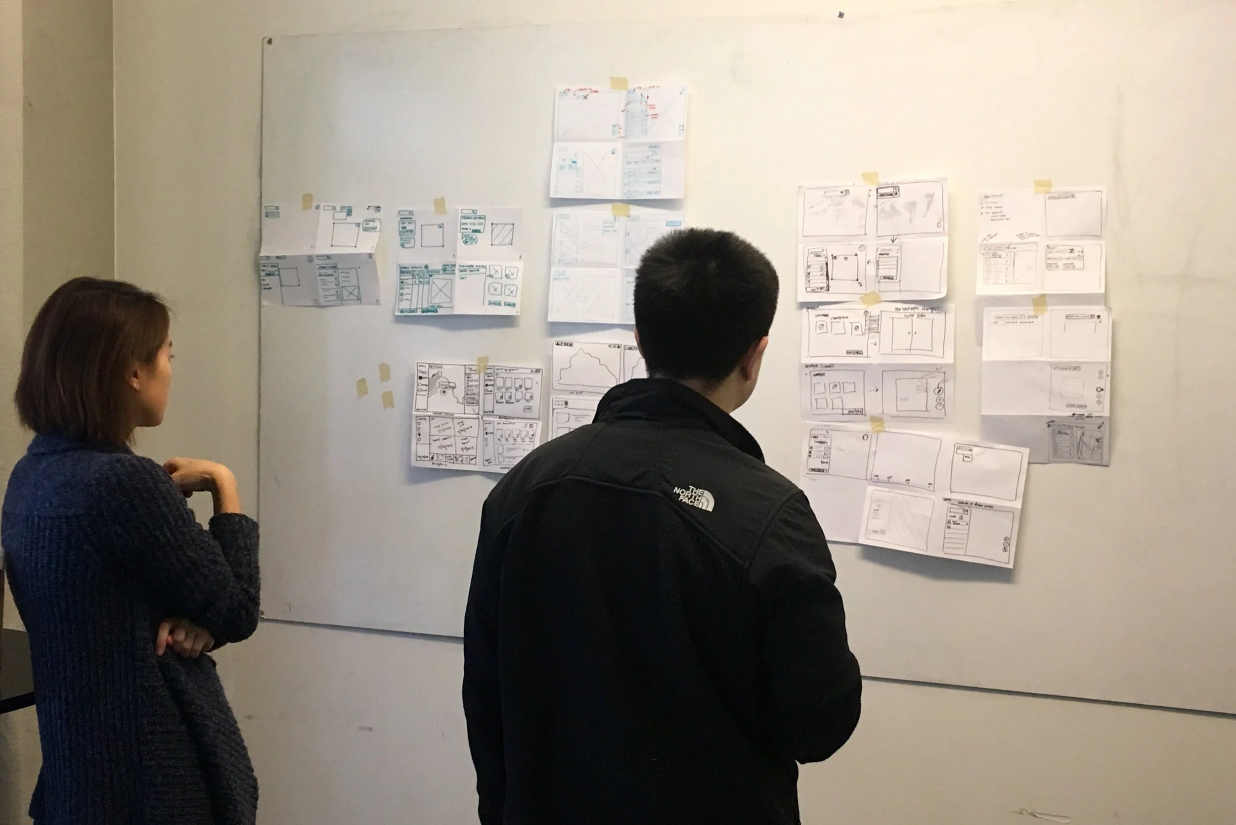
Lo-Fi Wireframing
We divided responsibilities of the UI screens and, using the whiteboard sketches as a starting point, each created wireframes on Sketch. Then I consolidated the screens and made a clickable prototype.

Product Update
At this point, the Earth Genome team updated us that from their ongoing commercial negotiations, the satellite imagery that Spot would provide will be free and low cost pngs instead of geotiffs. Based on our previous user interviews, we knew that geotiffs was something that journalists were asking for, so we reached out to them to talk about our update.
User Walkthrough
Over screen-sharing, I did a walkthrough of the lo-fi prototype with journalists and graphic editors at two news agencies. and also asked for their feedback about providing pngs instead of geotiffs. Two insights we learnt:
Geo-data was important. If not geotiff, they will need the png plus geo-data accompanying it.
They need a way to organize imagery based on the story they are using it for.
We delivered these insights to Earth Genome team and confirmed that certain geo-data will be provided with the pngs. We also whiteboarded different ways to organize imagery, then updated the wireframes and prototype.
Usability Testing
We tested the lo-fi prototype with 5 users by giving them a scenario and a list of tasks to complete. We identified pain points from our tests and used affinity mapping to group them into categories, and iterated based on the feedbacks.
HI-FI PROTOTYPING AND VALIDATION
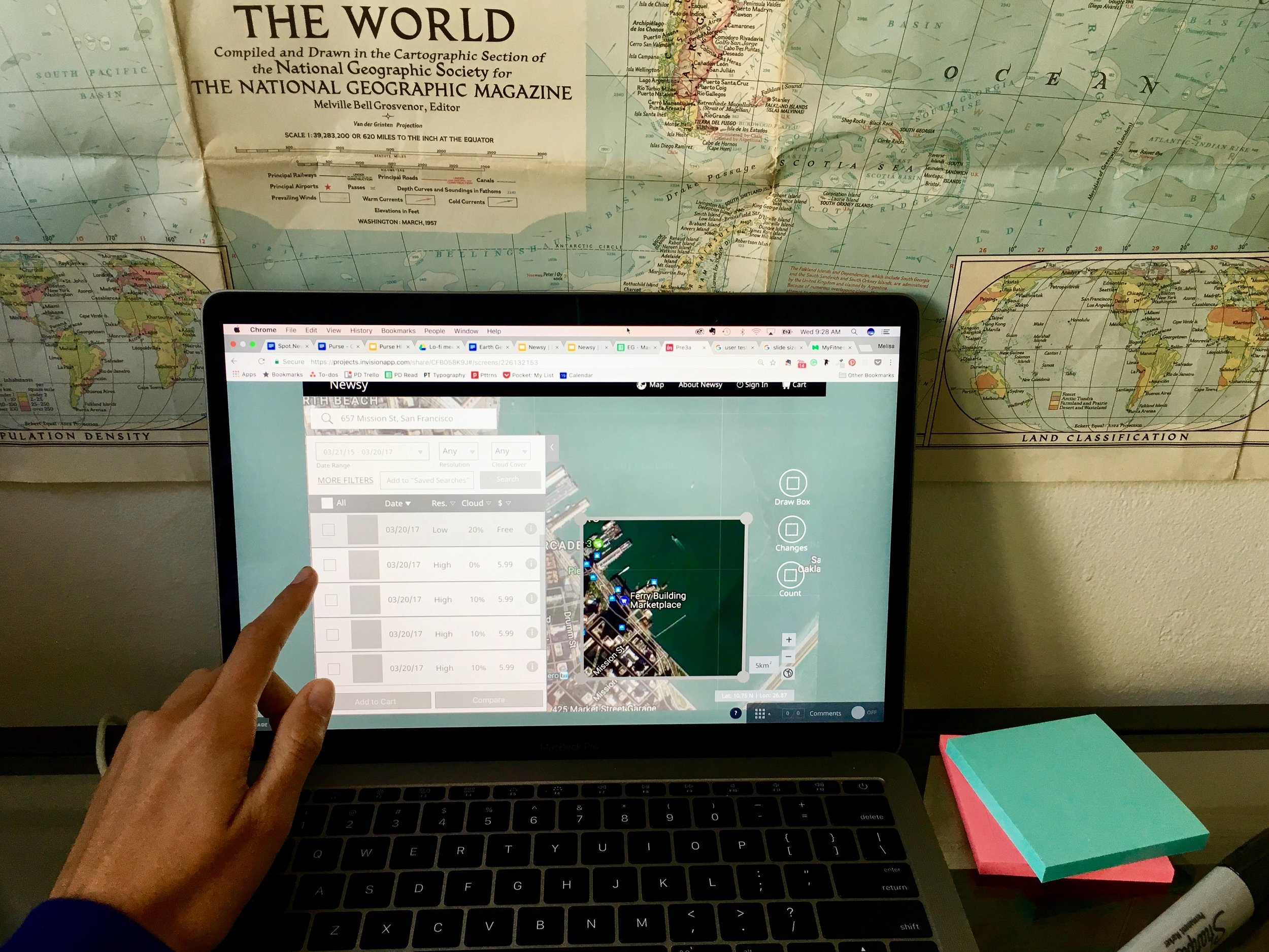
Hi-Fi Mockups
To be more organized and work more efficiently as a team, we decided to use Abstract which is a version controlled workflow tool, like GitHub for designers. We first designed reusable components, then we created individual screens based on the components and style guide. I then made a clickable prototype.
Validation Testing
Round One
We did validation testing with 5 new users for each of the desktop and mobile prototype using the same scenarios and tasks in the lo-fi validation testing. The results showed that we had solved most of the pain points identified in the lo-fi usability testing. One of the key pain points remaining was users struggled with the Count Objects analysis tool. Users can use this tool to count similar objects on a satellite imagery, e.g. number of people, trees, cars, and it saves them time to count manually.
We found users (a) weren't aware of the count object tools and (b) didn't understand how the tool worked. We had to design a better onboarding tutorial for first time users who have purchased satellite imagery. We identified two places to guide users: (a) All Images gallery where the user first land after purchasing imagery, and (b) Count Objects application page where user has selected an imagery to analyse. Here's how we resolved the pain point:
All Images page: Our previous design was hover tooltips but they were ineffective and 4/5 users did not hover over the toolbar. We redesigned to coach marks which forces the first time user to click through the Move, Count and Show Differences tools. The objective was to make users aware of the Count Objects tool.
Count Objects page: Our previous design was coach marks with just text. Our redesign was a step-by-step coach mark with visuals showing example of how to draw and rotate the box. The coach mark in the next step will only show up after the user has completed the previous step.

Round Two
To ensure we solved the pain points, we tested the updated desktop and mobile prototypes each with 4 new users. All users were able to complete the tasks with relative ease! Hurray!
Outcome
For the final deliverables, we delivered the assets for the desktop and mobile mockups and clickable prototypes with Zeplin export, along with a comprehensive documentation on interactions. The Earth Genome team is currently in the process of developing the application that we designed.
Based on our conversations with users, we also delivered several areas that the Earth Genome team could potentially explore in future versions of the product after receiving more customer data:
Geotiff: Offering imagery in geotiff format.
Polygon AOIs: Give users more freedom to draw AOI boxes in polygon shape instead of just rectangles.
Count Objects: Use machine learning for the application to automatically identify common objects for counting.


TAKEAWAYS
Talk to the users: A deep understanding of the customer needs and goals is paramount when designing for a new product. When we had to change our product features because of technical and commercial reasons, it was important to get feedback from them if the new solution would still solve their pain points.
Some interactions are hard to test: Designing interactions require thoughtfulness and attention to detail. It was difficult to test some interactions through our prototyping tool. We found the best way was to pick other products with similar interactions and conduct usability tests, and informed with the results, design the interaction that suits our users.
Test early and often: Testing with a lo-fi prototype was important to get critical feedback from users and solve usability issues, so that we can carry all that we learnt into hi-fi.