
Overview
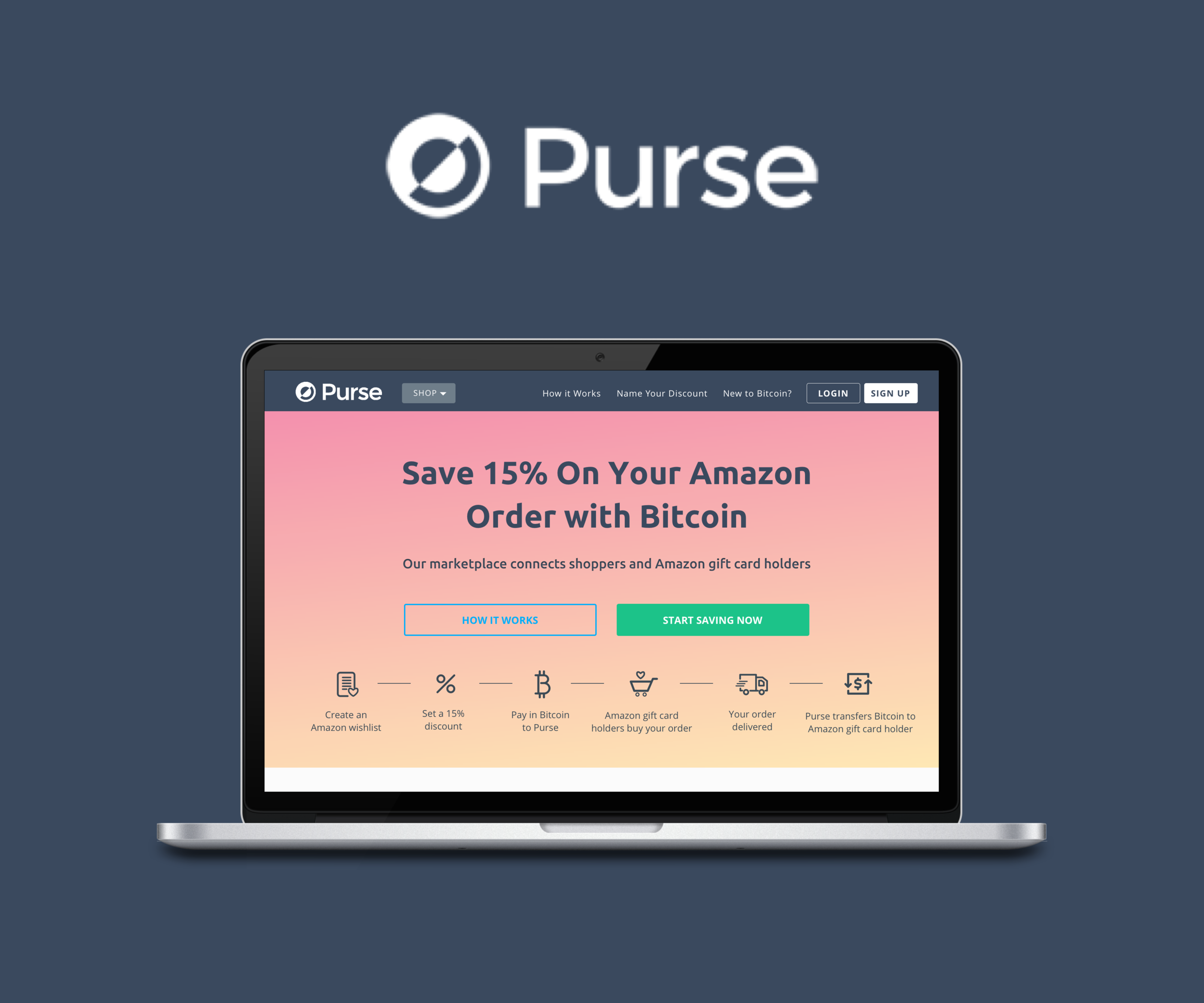
Purse is the leading Bitcoin-supported marketplace and eCommerce site. It allows you to purchase products on Amazon using Bitcoin at a discount in two ways:
Name Your Discount (NYD): You can import your Amazon wishlist to Purse and select a desired discount amount up to 30%. Earners who are people with unwanted Amazon gift cards will purchase your wishlist in exchange for Bitcoin.
Buy Now: You can purchase products listed on Amazon at a 5% discount by paying in Bitcoin to Purse.
NYD is Purse's main offering. Purse wanted to redesign their existing responsive web app to increase engagement and NYD conversion rate for its new users.
THE CHALLENGE
Redesign the existing responsive web app to:
improve a new user’s comprehension of Purse’s value proposition in particular to NYD; and
improve the sign up and checkout flow for NYD.
Explore an alternative visual style that was aligned with the brand principles of Purse.
MY ROLE
Product Designer
User Research
UX Design
UI Design
Prototyping
Usability Testing
Timeline
8 Weeks
Platform
Responsive Web App
THE OUTCOME
Delivered on the redesign of Purse's responsive web application with an updated style guide.
Validated with new users that the redesign improved their comprehension of Purse's services and completion of the sign up and checkout flow.
Design was developed and shipped in 2017 and led to decrease in drop off rate, bounce rate, more engagement and NYD conversion.
Stacey was a pleasure to work with and delivered high quality design which aligned with our business goals. We will be implementing her designs shortly. She's a professional with a clear and effective communication, and I'd highly recommend her to any team looking for a great designer.
— Andrew Lee, CEO at Purse
Click around our final prototype, or watch it in action below.
Before

After

Design Process

Empathize
Personas
Purse has two customer personas:
the Bitcoin Shopper who is familiar with Bitcoin and is looking for an easy way to spend Bitcoin; and
the Savvy Shopper who has never used Bitcoin but would go the extra mile to search for discounts.
Purse wants to increase customer conversion for NYD for both customer segments and in particular the Savvy Shopper segment which is a much bigger market but have a much lower conversion rate.
Competitive Analysis
We started with competitive research to study the competitive landscape of Bitcoin-supported ecommerce sites or marketplaces. We looked at the user experiences and features they offered to see what we might learn from their strengths and weaknesses. We found that all of the sites do not do a good job at introducing Bitcoin to new users.

Usability Testing
Then we interviewed and conducted usability testing on the existing Purse website with 5 new users - 3 who fit the Savvy Shopper persona and 2 who fit the Bitcoin Shopper persona. We provided the users with a scenario and observed them go through the process of purchasing items via NYD.
Our goals were to understand:
Do they understand the value proposition of Purse
Do they understand how NYD works
What would stop them from using Purse
What worked well and should remain the same
What could be improved and changed
Define
Synthesizing Insights
We analyzed the results of the usability test to identify all pain points and grouped them into themes using a Trello board. Here are some of the key insights:
Comprehension: On the landing page 4/5 users had difficulty understanding the value proposition of Purse. 5/5 users had difficulty understanding the difference between NYD and Buy Now.
Sign up: 4/5 users said that the sign up wall right after the landing page will stop them from continuing engaging with Purse because they are not ready to sign up at this stage.
NYD flow: 5/5 users had difficulty finding how to start and complete the NYD flow.
Trust: 3/5 users expressed that trust in Purse and Bitcoin will be a factor preventing them from using its service.

We decided to focus on the following objectives in our redesign:
Improve comprehension of a new user of Purse's value proposition and difference between NYD and Buy Now
Create a gradual sign up flow as part of the checkout process
Make NYD more prominent on the home page
Improve user experience of the NYD checkout flow
Improve user’s trust in Purse and Bitcoin
Task Flow
Based on the usability test results, we also mapped a task flow of a new user's journey through Purse's current sign up and onboarding flow and the NYD flow. The highlighted areas are the pain points which we will tackle in our redesign.


Style Guide
We kept in mind that we wanted our design to align well with Purse’s brand principles: Helpful, Friendly, Direct. Based on the brand principles, we explored different sets of typography and color palettes that were similar to but brighter than its existing color palettes. Here is our final updated style guide.

Ideate
Design Studio
I led a Lean UX Design Studio for the Purse team to quickly brainstorm ideas and designs for the UI and generate as many alternatives as possible. After rapid sessions of sketching, presentation and critique, we converged on the best ideas via dot-votting, and sketched the rough UI on the whiteboard.


LO-FI PROTOTYPING AND VALIDATION
Lo-Fi Wireframing
Using the whiteboard sketches as a base, we created 2 versions of the low fidelity wireframes in Sketch. In V1, we removed the landing page so the user will directly land on the home page and see the products. I was in charge of V2. In V2, I updated the landing page to clearly show two different ways of using Purse – Name Your Discount and Buy Now, and having two separate entry points into NYD and Buy Now flow. Here’s a snap shot of the V1 and V2 screens.

Validation Testing
We created clickable prototypes of the two lo-fi wireframes and conducted comprehension and usability testing with 4 new users for each prototype. This was to help us validate our early designs and get insights on what to improve and change before going into hi-fi.
Some of the key insights:
Confused about how Buy Now and Name Your Discount works. Users didn't understand the difference between the two and why they would choose a lower discount over a higher discount. This confusion increase their mistrust in the service.
Users generally did not hover over tooltips. Some information on Buy Now and NYD was in the tooltips but this was missed by most users.
Visual diagram was helpful. Visual diagram of mechanics of NYD on landing page was more helpful than text.
I also updated V2 to remove the landing page and incorporate its content into the home page and a new How It Works page.
HI-FI PROTOTYPING AND VALIDATION
Hi-Fi Mockups
To resolves the issues around comprehension we found during the validation testing, we:
Tested different copies in the headline, tagline and benefits on home page, How It Works page and product page.
Removed tooltips. Essential information was put directly in UI and supplemental information could be accessed by clicking on Learn More.
Added guided instructions in checkout flow on how to create wishlist and choose discount.
We made two versions of high fidelity mockup with different home page design and copies, and created clickable prototypes of each. I was responsible for version 2.

Validation Testing
To test if we resolved the pain points we found in the lo-fi validation testing, we tested V1 and V2 of the hi-fi prototypes with 5 users each firstly with five-second testing then using the same scenario and tasks in a usability testing. We found that V2 had better results in comprehension and user experience.
Here’s an overview of the final results of our design changes (current website before our design vs after our final V2 design):

OUTCOME
We delivered the final desktop and mobile designs and clickable prototypes with Zeplin export to the Purse team. Our validation tests show that our redesign has successfully achieved the objective of improving comprehension of the Purse service and user experience of the sign up and checkout flow. Our design was implemented by Purse and had positive impact on improving the decrease in drop off rate, bounce rate, engagement and NYD conversion rate.


TAKEAWAYS
Purse has a great offering but its NYD flow is complicated and it was a challenge for new users to understand how it works. Through multiple iterations, I learnt how to:
present just enough information upfront to answer a user’s biggest concerns and induce a user to keep engaging with the site;
teach the user how NYD works by guiding him through the actual checkout flow, putting essential information directly in the user interface; and
keeping supplemental information in Learn More tooltips or How It Works page for users who wanted to understand more.